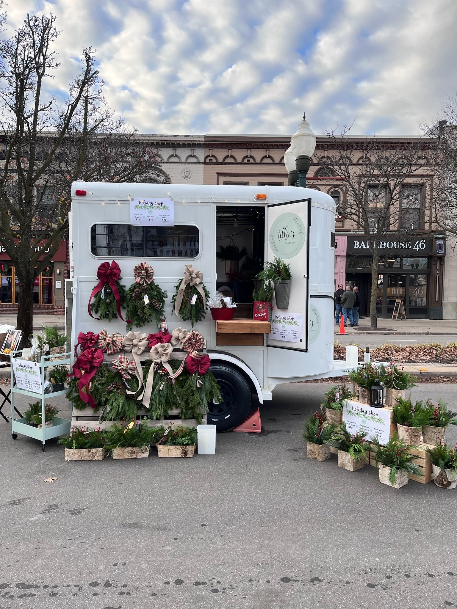
Tillie’s Flower Farm
Brand Development
When we started to discuss the logo and brand development of Tillie’s, my client had a clear vision of producing a logo that felt delicate like the petals of a flower and yet would stand out and create a connection between her flower farm business and her grandmother Tillie’s legacy that inspired it.
We worked tirelessly to create these three logo iterations to give Tillie’s the flexibility to grow and market their beautiful blooms in several markets and environments.
Tillie’s primary logo contains the wreath below. The secondary logo contains the laurels, and an additional logo contains a trailer in a bouquet of florals, thoughtfully designed to reflect several of the floral species grown and sold by Tillie's.


